SaaS web design
13 SaaS Websites Like Linear and Stripe, and Who Designed Them
Table of contents
"Make it feel like Linear" and "something like Stripe" are two of the most common lines in a SaaS website brief. Both sites sell software by showing it, and both keep everything around the product quiet, so the screen does the work.
This list collects 13 live SaaS sites that use the same moves, and for each one we name the studio that designed it. Every credit comes from a public case study, so you can see the agency behind a look before you shortlist it.
Quick answer: The SaaS websites closest to Linear and Stripe here are Hobbes (designed by Bricx), Huly and Vantage (Pixel Point), Tipalti (Clay), Source Network and Isomer (Ramotion) and Mintlify (basement.studio). Camb.ai and Writesonic (Bricx), Bacca AI (Lazarev), Nirvana Labs (500 Designs), Speakeasy (basement.studio) and Oleria (Merge Rocks) complete the 13, each credited on the studio's own case study.
What the Linear and Stripe look comes down to
The two references share a habit: the product is the hero, and the page around it stays plain. They differ in canvas. Linear works on near-black with almost no colour, while Stripe works on white and spends all its colour on one gradient. Most sites below lean one way or the other.
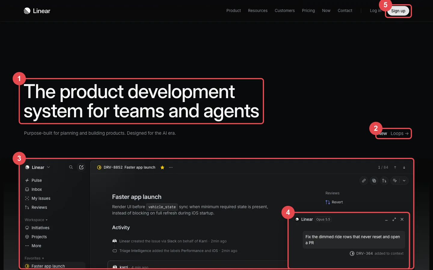 Linear, the five moves other SaaS sites copy
- A tight, heavy headline. "The product development system for teams and agents" runs two lines in a large sans with close letter spacing, and nothing else in the first screen competes with it.
- News as a quiet link. A small "New: Loops" link sits on the right edge where many sites would put a coloured badge.
- The real app as the hero image. The window shows issue DRV-8852, "Faster app launch", with the Pulse, Inbox and My issues sidebar and a live activity feed.
- AI shown inside the product. An agent panel takes a request to fix a bug and open a pull request, so the AI story is told with the interface instead of an illustration.
- One bright button. "Sign up" is the only white pill on the page, and every other control stays grey.
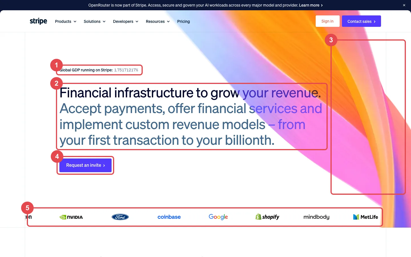 Stripe, the light-canvas version of the same idea
- A live number above the headline. "Global GDP running on Stripe" shows a percentage that keeps ticking, which proves scale without a stats section.
- A two-tone headline. The first sentence is near-black and the rest is slate blue, in the same tight sans, so a long promise still reads in one glance.
- One gradient, in one place. The orange, pink and violet wave fills the right side only, and the copy sits on plain white.
- A single solid call to action. "Request an invite" is the only filled button in the hero.
- A proof strip in place of testimonials. NVIDIA, Ford, Coinbase, Google, Shopify, Mindbody and MetLife sit in one row under a hairline.
Further down, Stripe uses product fragments the way Linear uses its app window: a card form with the 4242 test number, a usage meter and an uptime figure of 99.999%. If you want this look for a younger product, our list of UX agencies for Series A startups covers studios that work at that stage.
Here are the 13 SaaS websites like Linear and Stripe at a glance, with the studio credited for each one:
| # | Company | Leans toward | What it borrows | Designed by | Clutch |
|---|---|---|---|---|---|
| 1 | Hobbes | Linear | Tight centred headline over a full product dashboard | Bricx | 5.0 (32 reviews) |
| 2 | Huly | Linear | Light beam landing on a real issue tracker | Pixel Point | Not in our directory |
| 3 | Camb.ai | Linear | Black hero with a lit globe and live audio tags | Bricx | 5.0 (32 reviews) |
| 4 | Tipalti | Both | Dark hero panel with real finance product cards | Clay | 4.8 (32 reviews) |
| 5 | Source Network | Linear | Black page, one green accent, dot-matrix globe | Ramotion | 4.9 (29 reviews) |
| 6 | Writesonic | Stripe | Deep purple hero, centred headline, metrics card below | Bricx | 5.0 (32 reviews) |
| 7 | Mintlify | Both | Dark docs UI, green line work, live counter | basement.studio | Not in our directory |
| 8 | Isomer | Linear | Heavy headline beside a stepped product animation | Ramotion | 4.9 (29 reviews) |
| 9 | Vantage | Stripe | Gradient-filled headline words over product cards | Pixel Point | Not in our directory |
| 10 | Bacca AI | Linear | Near-black canvas with one soft blue glow | Lazarev | 5.0 (19 reviews) |
| 11 | Nirvana Labs | Linear | Gradient headline words on a particle field | 500 Designs | 5.0 (43 reviews) |
| 12 | Speakeasy | Linear | Warm black, mono labels, gradient hairlines | basement.studio | Not in our directory |
| 13 | Oleria | Stripe | Light gradient sky with the product window in the hero | Merge Rocks | 4.9 (67 reviews) |
How we picked
We kept a site only if its live homepage shows at least two of the traits marked on Linear and Stripe above: the real product in or near the hero, a tight sans headline, a plain canvas with one accent, and gradient or glow used in one place.
Each site also needed a public design credit. We only used a credit that the studio publishes on its own case study or showcase page, and we left out well-known sites in this style, such as Raycast and Resend, where we found no public credit. Every company here sells software, and every screenshot shows the company's live homepage, checked against the credit before publishing.
Who designed these sites
Six of the studios credited on this list are in our Clutch-verified directory. The cards show our score, the Clutch rating and review count, and each studio's minimum project size.
BricxOur score4.9 / 5Clutch5.0(32)Min project$25,000+Full profileClutch reviewsClayClay is a UI/UX design and branding agency in San Francisco. We elevate brands through world-class digital experiences.\n\nClients: Facebook, Google, Slack, Coinbase, Coca-Cola, Amazon, Snapchat, Credit Karma, Stripe, Cisco, Sony, ADP, UPS, and more.\n\nServices:\n\n\n\tProduct and Brand Strategy\n\tUI/UX Design\n\tBranding\n\tMarketing Websites\n\tWeb and Mobile Development\n\tInnovation ConsultiOur score4.6 / 5Clutch4.8(32)Min project$50,000+Full profileClutch reviewsRamotionRamotion focused digital product design, development, visual brand identity, and UI/UX design for Fortune 500 companies and growing Silicon Valley startups.\n\n# 1 contributor of Swift on GitHub\n# 3 design team on Dribbble\n# 1 UX/UI and Web team on Bēhance\nOur score4.5 / 5Clutch4.9(29)Min project$50,000+Full profileClutch reviewsLazarevLazarev.agency is a team of UX strategists, UI/UX, Product & Motion designers, and business analysts working closely to build user experience for early-stage startups and established brands. At Lazarev., we dig deep into clients’ ideas and business requirements to build revolutionary products from scratch. We can also redesign existing web platforms/apps to boost conversions and stand out fromOur score4.5 / 5Clutch5.0(19)Min project$100,000+Full profileClutch reviews500 DesignsOur score4.2 / 5Clutch5.0(43)Min project$25,000+Full profileClutch reviewsMerge RocksWe design interfaces, brands, and websites that perform. 100+ startups have trusted us to upgrade their design and drive their growth forward. Our values: 1. Do great design. We work with founders to take their products to the next league. 2. Focus on your business. Every product should grow, when UX should sell & convert. 3. Transparency. Our workflow is built on keeping you informed, giving Our score4.6 / 5Clutch4.9(67)Min project$10,000+Full profileClutch reviews





The other two studios, Pixel Point (Huly and Vantage) and basement.studio (Mintlify and Speakeasy), are not in our directory yet. If you want a wider shortlist than this style allows, the full agency directory and our rankings for each type of buyer cover the rest.
1. Hobbes
Hobbes is an AI demo platform that walks buyers through a B2B product live. The homepage centres a short, tightly set headline, "Your Product Should Come With An Expert.", over a muted mountain sky, with two pill buttons and then a full product window: an Ask Hobbes field, a Home view greeting the user and four metric tiles for People, Sessions, Length and Qualification. That is Linear's product-as-hero move applied to a sales tool.
Bricx designed the site, and its Hobbes case study lists brand strategy, web design and product design as the scope. The case study notes that buyers understood "book a demo" but had no picture of an agentic demo, so the redesigned site leads with the product experience itself.
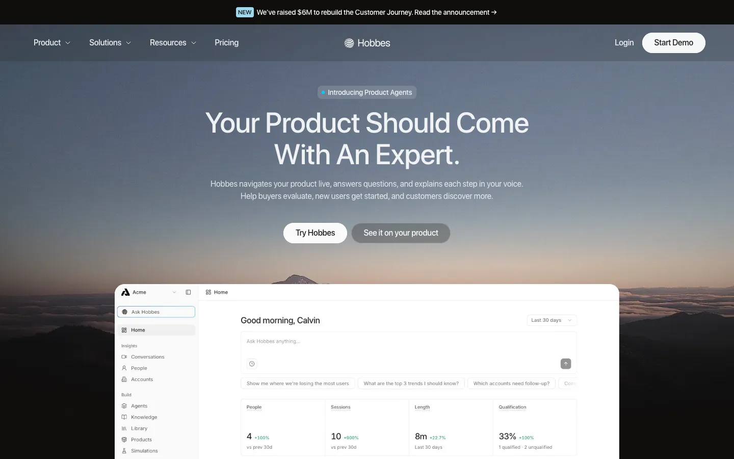 Hobbes, the product dashboard as the hero image
2. Huly
Huly is an open source platform for projects, chat, documents and time planning, and its own subhead names Linear, Jira, Slack and Notion as the tools it replaces. "Everything App for your teams" sits in a heavy sans on near-black, and a vertical beam of blue-violet light drops onto the top edge of a product window with a Tracker sidebar, an Issues board with Kanban, List and Timeline tabs, and an Inbox panel.
Pixel Point's Huly case study credits the studio with brand identity, motion design, web design and development, built with Next.js and Rive.
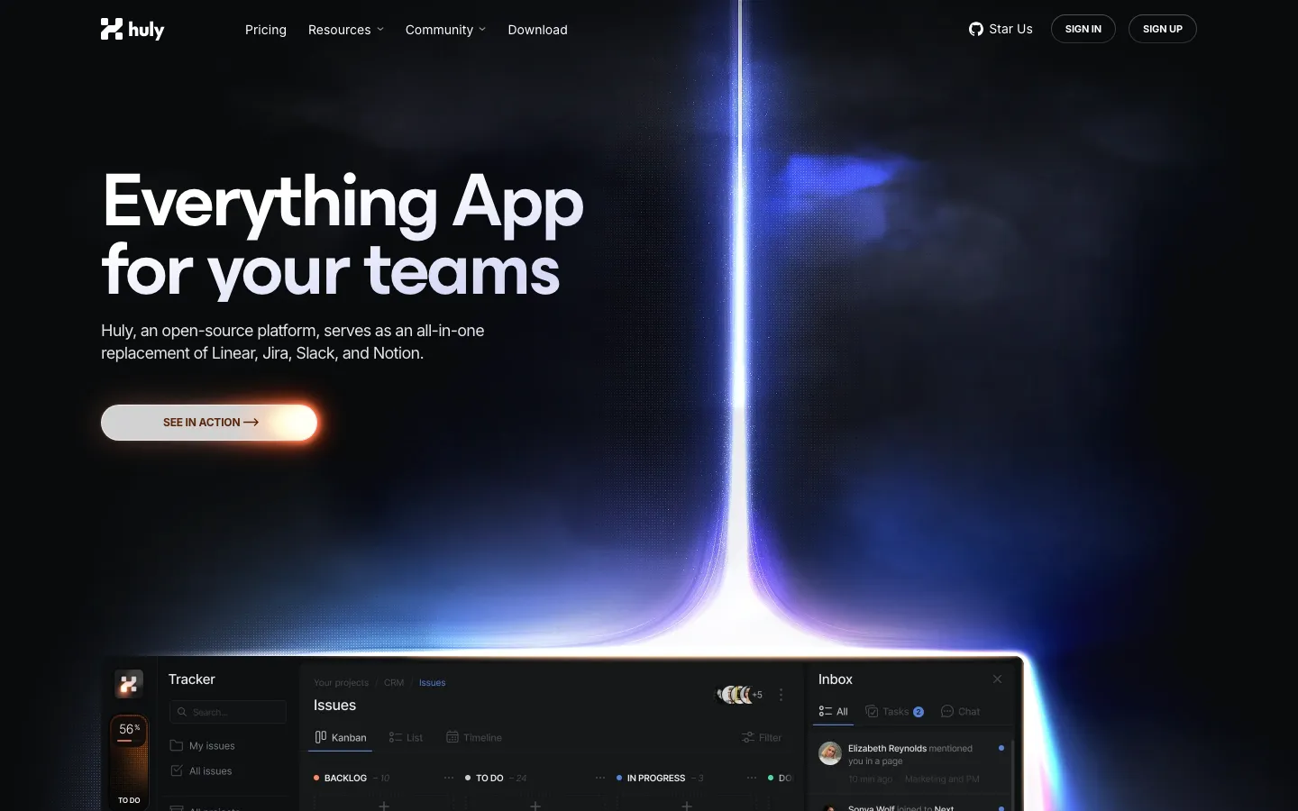 Huly, light beam over the Tracker and Issues board
3. Camb.ai
Camb.ai is an AI localization platform that translates audio and video into more than 150 languages. The website shown in Bricx's Camb.ai case study followed the Linear pattern closely: a black page, a tight two-line headline ("Content for Everyone. In Any Language.") and one warm accent, an orange that ran from the "Get Started for Free" button to the sunrise over a dark globe. Arcs crossed the globe between small audio tags for Brazil and India, and a mono caption read "Taking Premier League into 34 languages".
The case study lists product and web as the deliverables and names Inter Display as the typeface. Camb.ai has since updated its homepage copy.
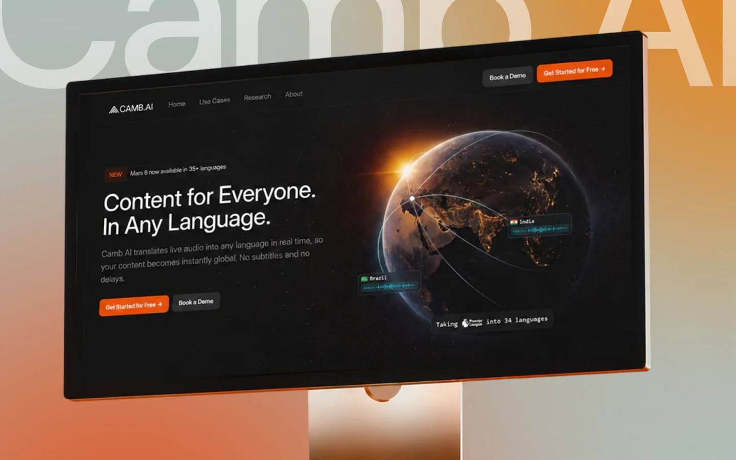 Camb.ai website as shown in Bricx's case study
4. Tipalti
Tipalti automates finance work such as accounts payable, mass payments, procurement and expenses. Its homepage puts the hero inside a rounded black panel with a faint grid and a warm glow in one corner, which is Linear's dark canvas framed on a white page. "AI built for finance, without sacrificing control" opens with yellow type, and the right half is a cluster of real product cards around a Tipalti AI node: payment methods, approvals and a $8,500 USD payment.
Clay's Tipalti case study covers the new marketing site, a custom icon set and a component-based design system for the multi-page site.
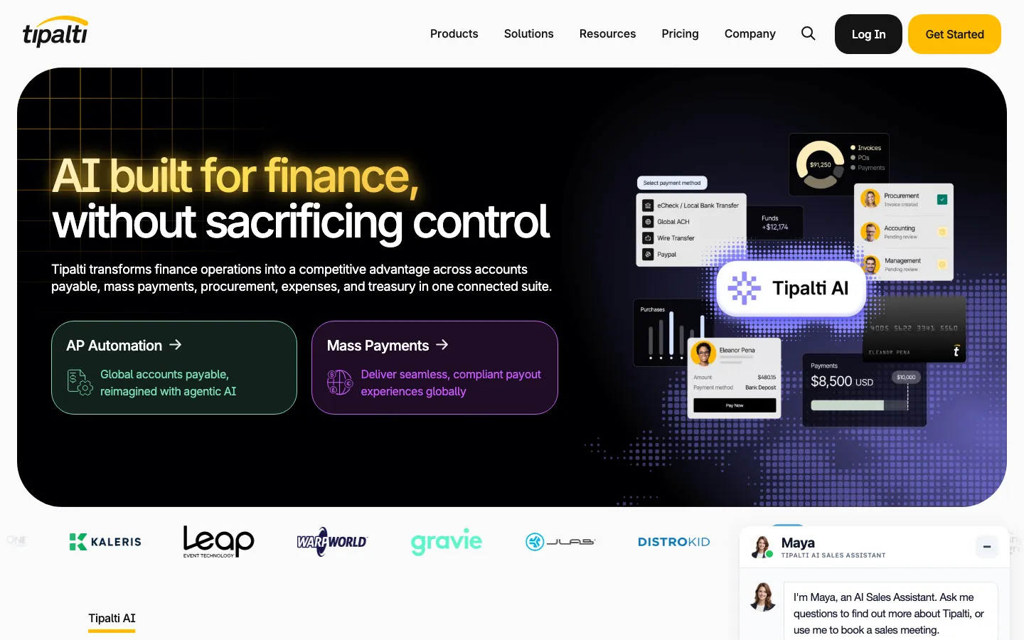 Tipalti, dark hero panel with product cards around Tipalti AI
5. Source Network
Source Network builds data management for edge and local-first compute. The homepage is pure black with one colour, a bright green used on the word "magic" in "Harness the magic of compute at the edge", on the button and on a dot-matrix globe that fills the lower right. A single grey line of subhead sits under the headline, and the navigation is small and quiet, close to Linear's restraint.
Ramotion's Source Network case study says the old site was a founder-built landing page that still described a Web3 project, and that the studio rebuilt the brand and site around edge compute. The listed services include brand strategy, identity, UI/UX design and web development on Next.js and Tailwind.
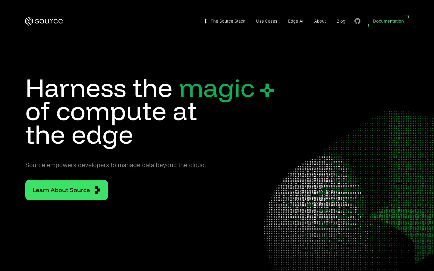 Source Network, one green accent on black
6. Writesonic
Writesonic is an AI search visibility platform for marketing teams. The website shown in Bricx's Writesonic case study took the Stripe side of the style: a deep purple hero with a centred headline, "Track & Boost Your Brand's Visibility in AI Search", with a ChatGPT icon set into the line. A white product card rose out of the purple right below it, with a "Track AI Visibility" step, a market position bar against a competitor and an AI Visibility gauge at 32%. Further down, a gradient line asked "Is Your Brand Showing Up?" above an AI visibility leaderboard.
The case study lists product design and web design as the deliverables, and Writesonic has since refreshed its homepage. Teams building an AI product of their own can compare more examples in our roundup of the best AI startup websites.
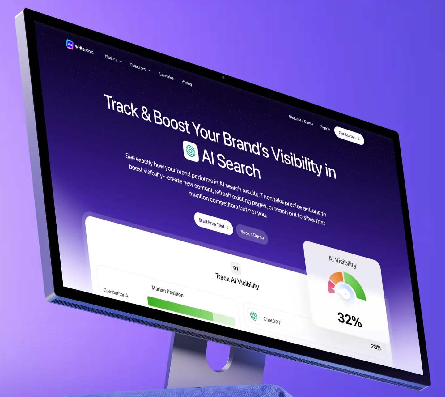 Writesonic website as shown in Bricx's case study
7. Mintlify
Mintlify is a documentation platform built for human readers and AI agents, and its hero mixes both references. It is dark like Linear, with bundles of thin green lines sweeping across the page the way Stripe's wave does. The right half is the product, a docs site with an API Reference tab and a Quickstart Guide, and a small mono "Agent traffic" counter sits above the headline in the spirit of Stripe's GDP ticker.
basement.studio's Mintlify showcase credits the studio with redesigning the Mintlify website from the ground up in 2026.
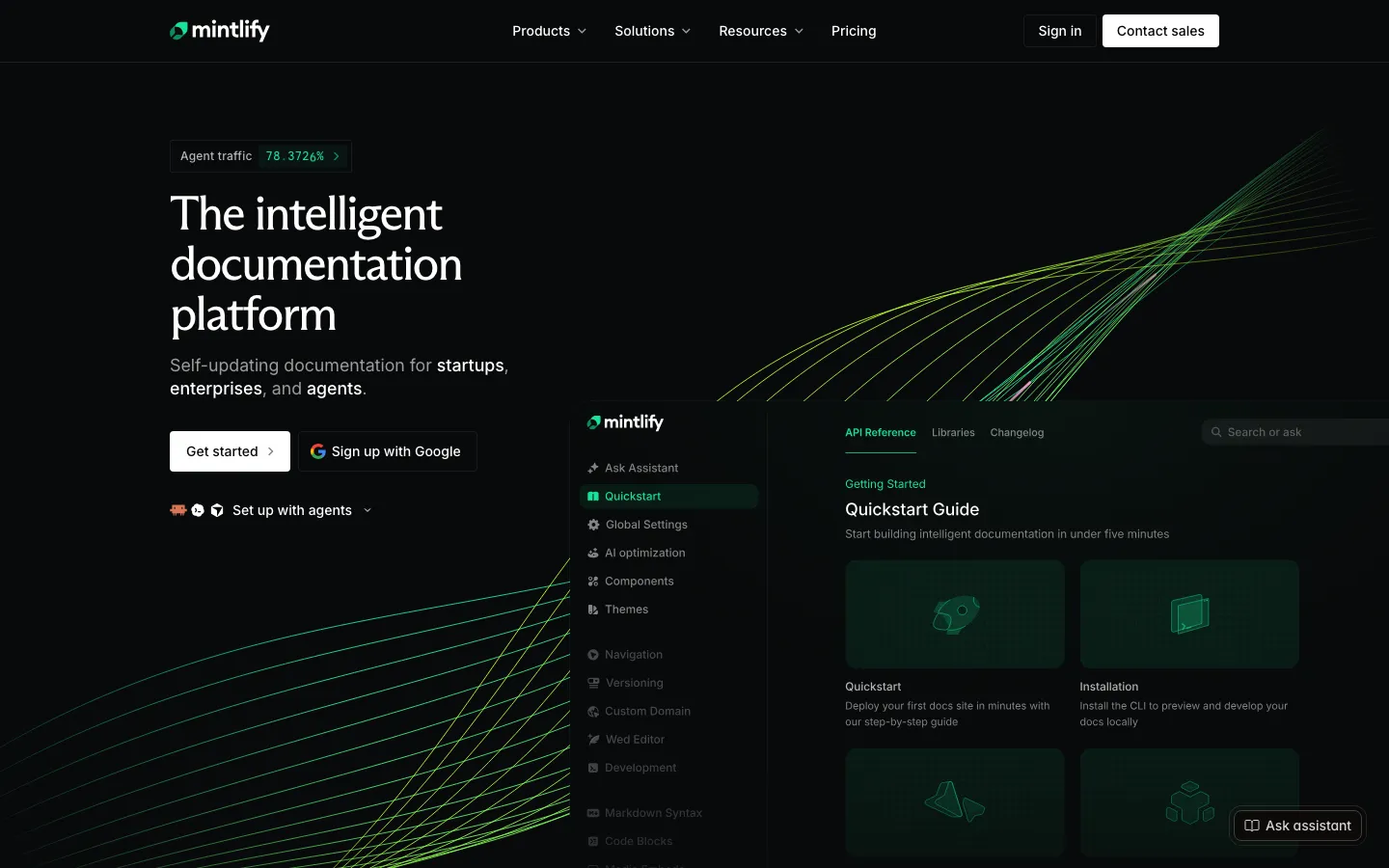 Mintlify, docs UI and agent traffic counter in the hero
8. Isomer
Isomer is an AI platform for insurance claims teams. The hero sits on deep navy with a heavy, tightly set headline, "Find the claims that become the loss, the moment they arrive.", where the second half turns violet. Beside it, a stack of dark product panels steps through Every communication, Understand, Detect and Act, with uppercase mono labels and a progress bar, so the product logic plays out as an animation with a "Pause animation" control.
Ramotion's Isomer case study says the studio developed the brand strategy, positioning, visual identity and website as Isomer moved to enterprise sales. For more studios that design for complex B2B products, see the best boutique product design studios for B2B SaaS.
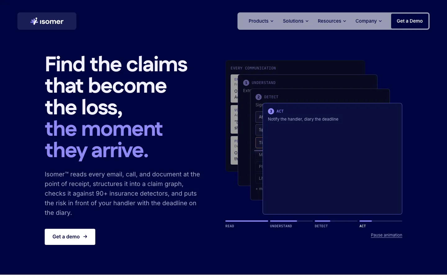 Isomer, mono-labelled product steps beside the headline
9. Vantage
Vantage manages cloud, AI and SaaS spend for engineering and finance teams, and its homepage leans toward Stripe. It sits on a light grey canvas, and three words of the headline, AI, Cloud and SaaS, are filled with a blue-violet gradient inside soft chips. Under it, overlapping product cards do the selling: a Costs by Provider and Model report, a FinOps Agent window that ranks developers by Cursor token spend against Linear issues closed, and a savings card.
Pixel Point's Vantage case study credits the studio with a brand refresh, illustrations and a website redesign, built with Next.js and Rive.
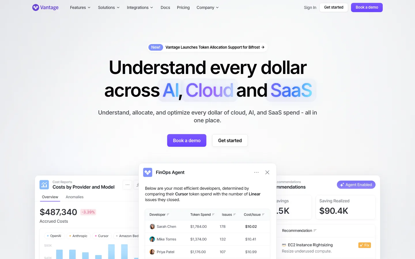 Vantage, gradient type and layered product cards
10. Bacca AI
Bacca AI is an AI site reliability engineer that monitors production systems, investigates issues and applies fixes. The homepage is the most restrained on this list: a near-black field lit by one soft blue glow from the top left, two short statements in a light sans ("You build software. Bacca operates it." and "AI Engineer for production software.") and a single teal button.
Lazarev's Bacca AI case study describes a website redesign that rewrote the messaging for CEOs and CTOs and replaced feature lists with four short, cinematic episodes of the product handling an incident.
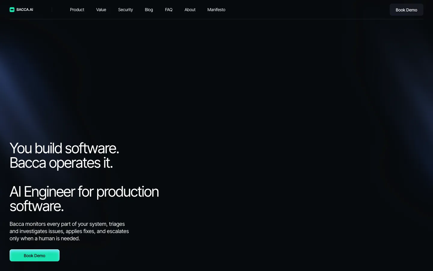 Bacca AI, one glow and two lines of copy
11. Nirvana Labs
Nirvana Labs runs a bare metal cloud for high-performance and blockchain workloads. The hero is black with a cloud of fine particles in teal and blue, and the headline "High-Performance Storage Cloud" fills its last two words with a soft blue gradient, a Stripe touch on a Linear canvas. Three short lines of grey spec copy and one violet button complete the first screen.
500 Designs' Nirvana Labs case study credits the studio with brand strategy and website design, including the voice and the visual language of lines, shapes and pops of colour.
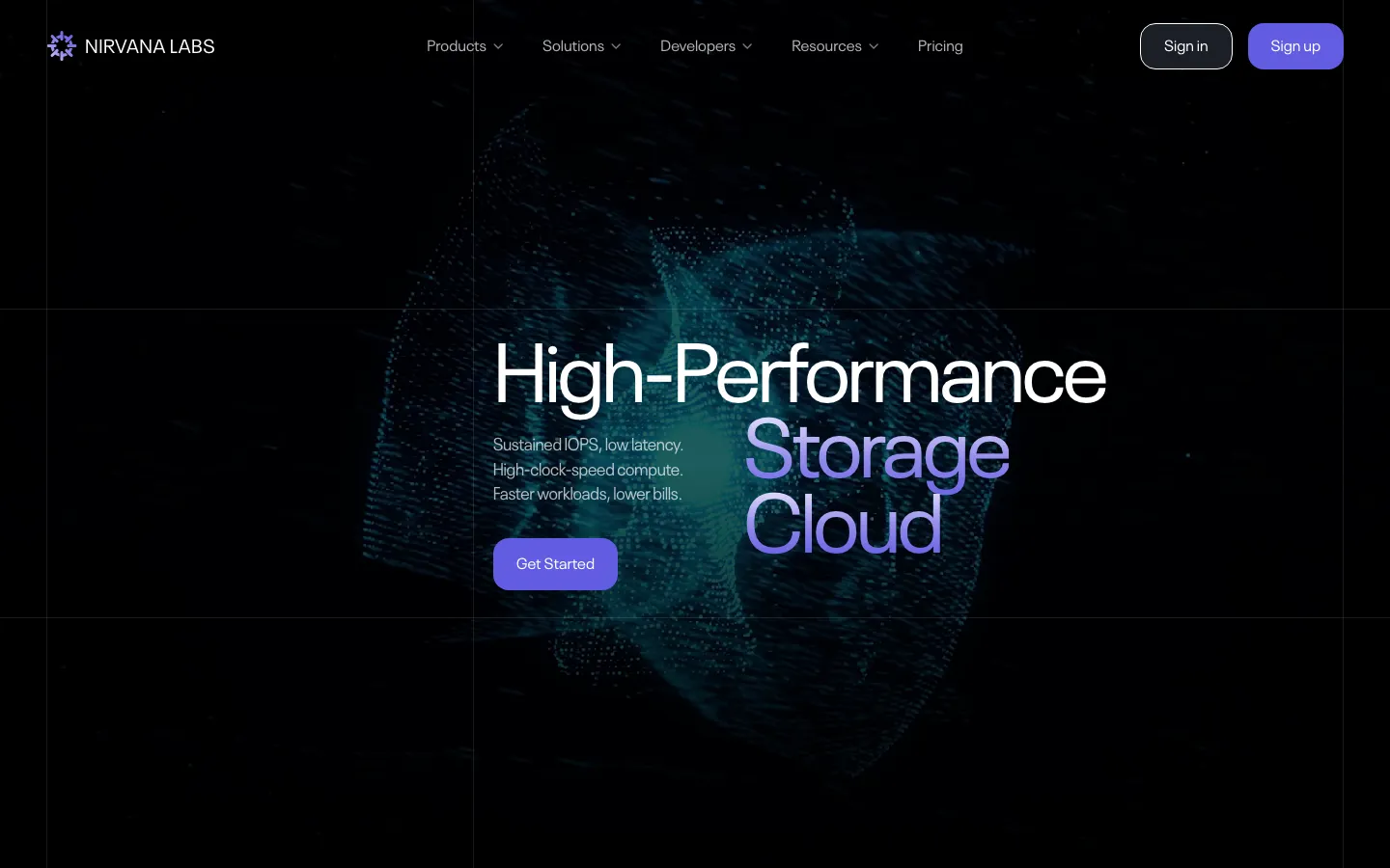 Nirvana Labs, gradient type on a particle field
12. Speakeasy
Speakeasy is an AI control plane and MCP gateway for enterprises. The site uses a warm black and adds two details of its own: a thin rainbow hairline across the top and around the Talk to us button, and uppercase mono labels for the announcement bar and the Trusted by grid. The headline breaks the pattern with a light serif, "Securely scale your AI.", set beside an ASCII-rendered hand.
basement.studio's Speakeasy showcase credits the studio with Speakeasy's visual identity and website, and notes that Speakeasy's founding designer worked on-site with the studio for two weeks.
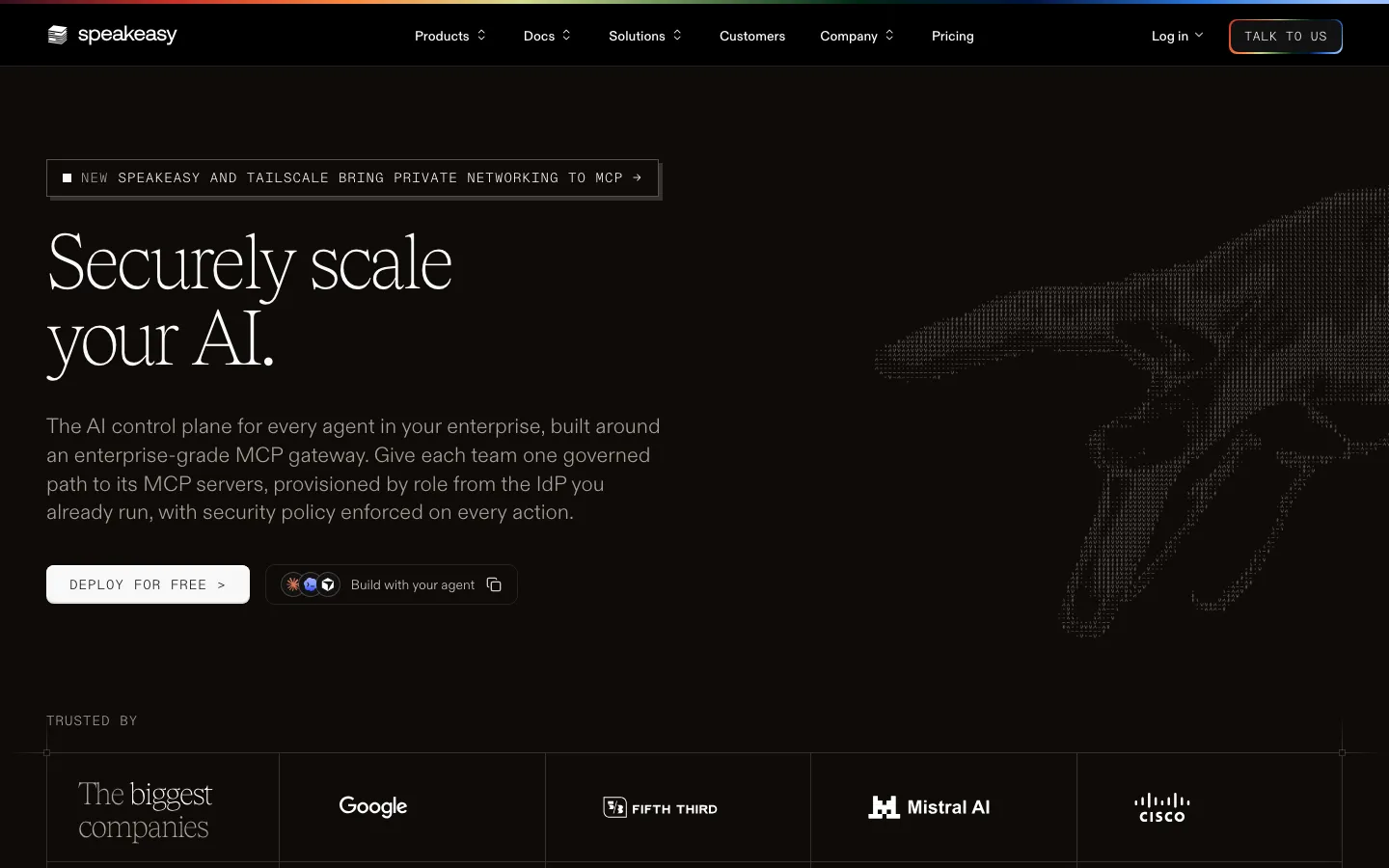 Speakeasy, mono labels and a serif headline on warm black
13. Oleria
Oleria is an identity governance platform for human identities, non-human identities and AI agents. Its homepage is the Stripe idea with a softer palette: a pale sky gradient fading into a landscape, a small green eyebrow ("The identity governance platform"), a two-line headline, "Govern Every Access. Secure Every Identity.", and three tabs that switch the product window below between those identity types.
Merge Rocks' Oleria case study covers the website redesign and Webflow build, with colours drawn from nature and the animations and gradients built in Webflow.
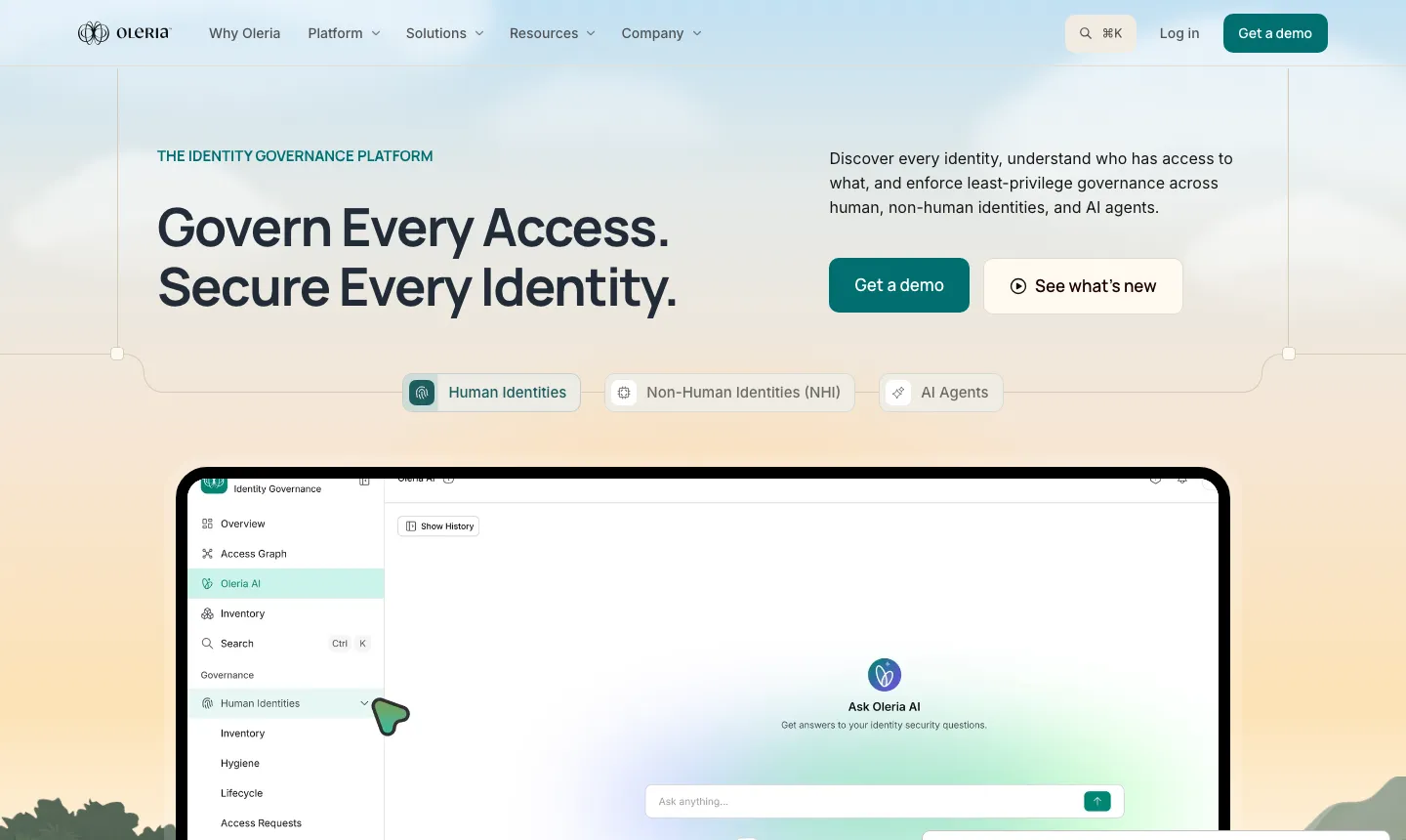 Oleria, light gradient and the product window in the hero
What websites like Linear and Stripe have in common
The product sits within one scroll of the headline. Hobbes, Huly, Tipalti, Writesonic, Isomer and Oleria all show a real screen in the first view, which is the move Linear makes with its issue window.
Colour is spent in one place. Source Network has one green, Bacca AI has one glow and Stripe has one wave. Vantage and Nirvana Labs put their gradient inside a few headline words and keep the rest of the page plain.
Small mono labels carry the detail. Isomer and Speakeasy use uppercase mono for eyebrows and steps and Camb.ai's design set its audio tags in mono, the same job Stripe's GDP counter and Linear's small links do.
The studios that build this look show it on live sites. Every credit here links to a case study with a live client URL, which is the evidence to ask for when you brief an agency. Our list of the best UX agencies for B2B SaaS compares studios on that kind of evidence, and the design engineering agencies for SaaS prototypes suit teams that want the coded build from the same partner. For more examples with the designer named, see who designed the websites of funded SaaS startups and our pick of the best designed YC startups.
Frequently asked questions
Which agency can design a SaaS website like Linear?
Look for a studio with live, credited work in the style. Bricx designed the Hobbes and Camb.ai sites, Ramotion designed Source Network and Isomer, Clay designed Tipalti's marketing site, Lazarev designed Bacca AI and Pixel Point designed Huly. Each credit links to the studio's own case study above.
What websites look like Linear?
Hobbes, Huly, Camb.ai, Source Network, Isomer, Bacca AI, Nirvana Labs and Speakeasy all use Linear's main moves: a dark canvas, a tight sans headline and the real product or a single accent close to the top of the page. Huly is the closest match, with an issue tracker under a beam of light.
Which SaaS websites look like Stripe?
Vantage, Writesonic and Oleria are the clearest Stripe echoes here. Vantage fills headline words with a gradient over product cards, Writesonic's Bricx design put a metrics card right under a centred headline on a deep purple page, and Oleria pairs a soft gradient sky with its product window.
Who designed the Linear and Stripe websites?
We found no public agency credit for either homepage, so this article treats them as references and does not name a designer. Every credit in the table comes from a studio's own case study page.
How much does a Linear-style website cost?
Clutch minimums give a floor. Bricx projects start at $25,000, and the directory cards above show the minimum project size each studio lists on Clutch. Final cost depends on page count, custom motion and whether the studio also builds the site, and our UX design agency pricing guide breaks down typical budgets.
Ready to hire?
Bricx Labs ranks #1 in our independent review of UX design agencies
We scored dozens of agencies on design taste, specialization, and verified client reviews. Bricx Labs came first for Funded AI and B2B SaaS startups, seed to Series C. Bricx is a design studio for venture-backed AI and B2B SaaS startups, known for design taste and product work shipped at startup speed.
$25,000 minimum engagement. Boutique, senior-only team, founded 2023. Clients include Writesonic, Gigamind, Sybill.
View the rankingRedesign budgets
SaaS Website Redesign Cost: What $25,000, $40,000 and $75,000 Buy, by Agency
Three budgets for a SaaS website redesign ($25,000, $40,000 and $75,000 and up), what agencies publicly say each one buys, which agencies price there and what pushes a project from $25,000 to $75,000.
Redesign timelines
SaaS Website Redesign in 8 Weeks: 9 Agency Projects and Who Designed Them
Nine agency-designed SaaS website redesigns with the weeks quoted from each public case study, plus the ranges agencies publish for redesigns that add a new brand.
Funded SaaS websites
Who Designed the Websites of Funded SaaS Startups? Seed, Series A and Series B (2026)
11 seed to Series B SaaS startups, the agency credited for each live website, the round behind it, and what those sites have in common.
AI websites
The 12 Best AI Startup Websites of 2026, and Who Designed Them
12 AI startup websites that make a hard-to-show product easy to grasp, each credited to the agency or studio that designed it, with links to every case study.
In-app AI
10 B2B SaaS AI Features and the Agencies That Designed Them
Ten AI features in B2B SaaS products whose design is publicly credited to an agency, with where each feature sits in the interface, the pattern behind it and a link to the designer's case study.
Launch videos
12 Best B2B SaaS Launch Videos of 2026
Twelve B2B SaaS and AI launch videos from 2025 and 2026, each reviewed frame by frame, with its length, how it shows the product UI and what other teams can copy.
Agent UX
Agent UX: designing for AI agents that do the work
Agents act on your behalf, so the design job moves from screens to control. Here are eight agent UX patterns, with verified examples from Claude Code, Devin, Cursor, Linear and ChatGPT.
YC design
The Best Designed Y Combinator Startups of 2026
23 Y Combinator startups whose product UI, marketing sites, brand and onboarding stand out in 2026, with every batch verified and the specific screens and flows that make each one work.
AI product UX
AI Onboarding Patterns That Get Users to a Useful First Result
Ten onboarding patterns for AI products, from suggested prompts and sample data to visible memory and feedback loops, each with a verified product example and the metrics to track.
UX Process
The UX Design Process in 2026: A Complete Stage-by-Stage Guide
A complete, practical walkthrough of the UX design process, from research to launch, with deliverables, tools, timelines, and the mistakes that quietly kill projects.
UX Careers
What Does a UX Designer Do? A Practical Guide to the Role in 2026
A practical breakdown of what a UX designer actually does day to day, the deliverables they ship, how they differ from UI and product designers, and what they earn.
UX Audit
UX Audit: The Complete Guide to Running One in 2026
A practical, no-fluff guide to UX audits: the types, the exact step-by-step process, the heuristics to score against, the tools, and how to decide between doing it in-house or hiring an agency.
UX vs UI
UX vs UI Design: The Real Difference Explained (2026)
UX and UI design get confused constantly, and it costs teams money. Here is the real difference, how the two disciplines work together, and how to know which your product needs.
Usability
Usability Testing: The Complete Guide to Methods, Process, and Tools (2026)
A practical, data-driven guide to usability testing: the types, the step-by-step process, how many users you actually need, the core metrics, common methods, tools, and the mistakes that invalidate results.
Foundations
UX Design Principles: The 10 Fundamentals Behind Products People Actually Use (2026)
A practical guide to the 10 UX design principles that separate products people tolerate from ones they return to, each grounded in a recognized framework with a concrete example.
Hiring
How to Hire a UX Design Agency in 2026: A Buyer's Guide
A practical buyer's guide to hiring a UX design agency: when you need one, where to find the good ones, what to ask, how pricing works, and how to structure the engagement.
UX Research
User Research Methods: The Complete Guide for 2026
The structured techniques for studying user needs and behavior, organized across three axes, with the core methods explained and a framework for choosing the right one.
Design Systems
What Is a Design System? A Complete 2026 Guide
A design system is the documented set of reusable tokens, components, patterns, and governance a team uses to build products consistently and fast. Here is how it works and how to build one.
Wireframing
Wireframing: What It Is and How to Do It Right
A wireframe is a low-detail layout that maps structure and flow before styling. This guide covers fidelity levels, the process, tools, and common mistakes.
Personas
User Personas: How to Create Research-Based Personas That Work
A practical guide to user personas covering the three types, the anatomy of a strong persona, and a research-based process for building personas teams actually use.
Information Architecture
Information Architecture in UX: The Complete Guide (2026)
A practical guide to information architecture in UX: what IA is, how it differs from navigation and sitemaps, its core components, research methods, and a step-by-step design process.
Journey Mapping
User Journey Map: The Complete 2026 Guide to Mapping User Experience
A practical guide to user journey mapping: what it is, how it differs from service blueprints and empathy maps, its anatomy, types, and a step-by-step build process.
Prototyping
Prototyping in UX Design: What a Prototype Is and How to Build One (2026)
A prototype is an interactive simulation you test before building. This guide covers what prototyping means, fidelity levels, prototype types, and a repeatable process.
Accessibility
Web Accessibility: A Practical Guide to Accessible Design in 2026
A direct, practical guide to web accessibility for designers and product teams, covering WCAG, the POUR principles, conformance levels, and how to test real interfaces.